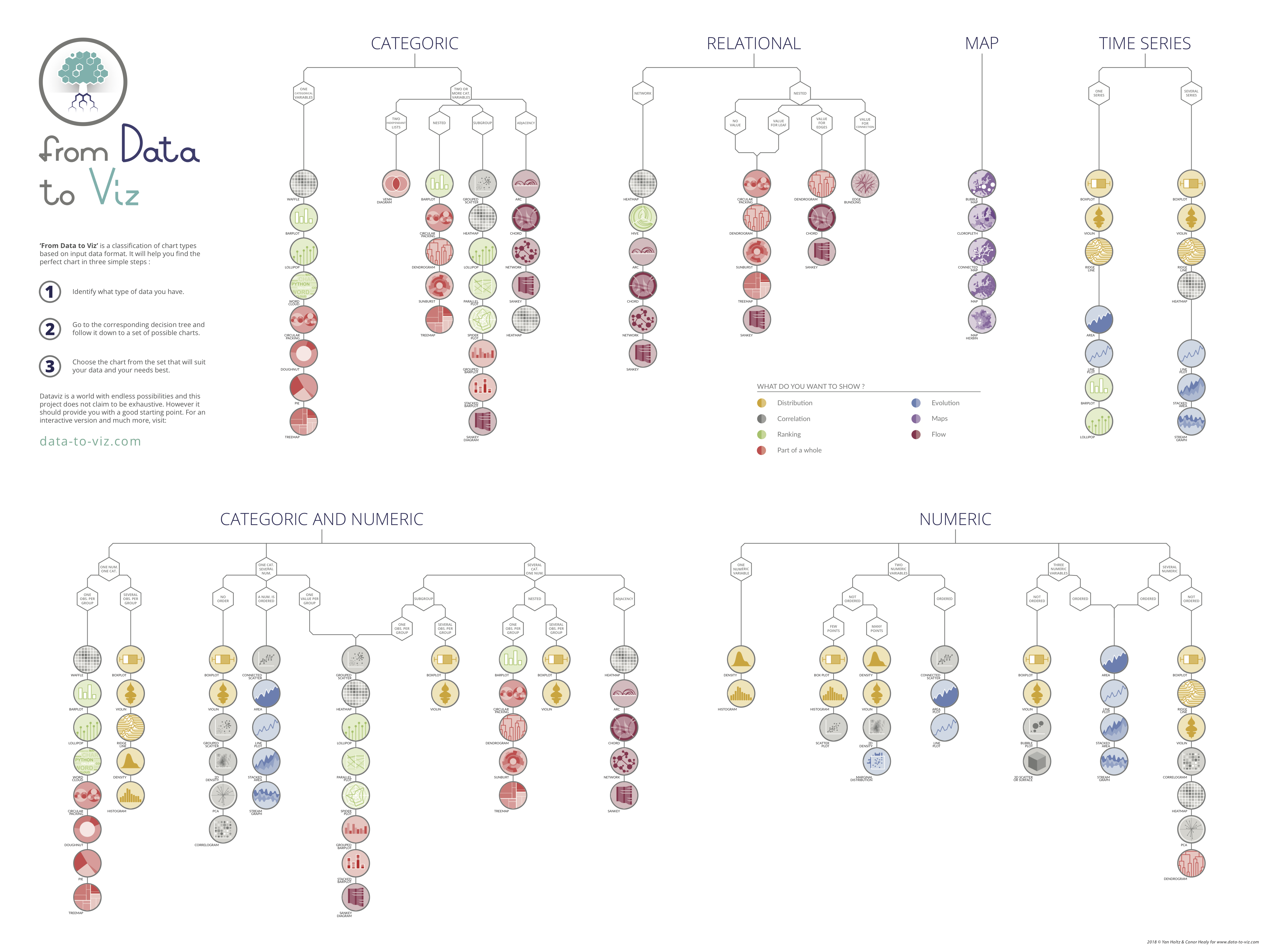
6.24. DataFrame Plotting
6.24.1. Plot kinds
line- Line Plotbar- Vertical Bar Plotbarh- Horizontal Bar Plothist- Histogrambox- Boxplotdensity,kde- Kernel Density Estimation Plotarea- Area Plotpie- Pie Plotscatter- Scatter Plothexbin- Hexbin Plot
6.24.2. Parameters
Parameter |
Default value |
|---|---|
x |
|
y |
|
kind |
line |
ax |
|
subplots |
|
sharex |
|
sharey |
|
layout |
|
figsize |
|
use_index |
|
title |
|
grid |
|
legend |
|
style |
|
logx |
|
logy |
|
loglog |
|
xticks |
|
yticks |
|
xlim |
|
ylim |
|
rot |
|
fontsize |
|
colormap |
|
table |
|
yerr |
|
xerr |
|
secondary_y |
|
sort_columns |
|
xlabel |
|
ylabel |
|
Parameter |
Type |
Default |
Description |
|---|---|---|---|
|
Series or DataFrame |
None |
The object for which the method is called |
|
label or position |
None |
Only used if data is a DataFrame |
|
label, position or list of label, positions |
None |
Allows plotting of one column versus another. Only used if data is a DataFrame. |
|
str |
|
|
|
tuple |
None |
(width, height) in inches |
|
bool |
True |
Use index as ticks for x axis |
|
str or list |
None |
Title to use for the plot. If a string is passed, print the string at the top of the figure. If a list is passed and subplots is True, print each item in the list above the corresponding subplot. |
|
bool |
None |
(matlab style default) Axis grid lines |
|
bool or 'reverse' |
None |
Place legend on axis subplots |
|
list or dict |
None |
matplotlib line style per column |
|
bool or 'sym' |
False |
Use log scaling or symlog scaling on x axis |
|
bool or 'sym' |
False |
Use log scaling or symlog scaling on y axis |
|
bool or 'sym' |
False |
Use log scaling or symlog scaling on both x and y axes |
|
sequence |
None |
Values to use for the xticks |
|
sequence |
None |
Values to use for the yticks |
|
2-tuple/list |
None |
|
|
2-tuple/list |
None |
|
|
int |
None |
Rotation for ticks (xticks for vertical, yticks for horizontal plots) |
|
int |
None |
Font size for xticks and yticks |
|
str or matplotlib colormap object |
default None |
Colormap to select colors from. If string, load colormap with that name from matplotlib. |
|
bool |
None |
If True, plot colorbar (only relevant for 'scatter' and 'hexbin' plots) |
|
float |
0.5 (center) |
Specify relative alignments for bar plot layout. From 0 (left/bottom-end) to 1 (right/top-end). |
|
bool, Series or DataFrame |
False |
If True, draw a table using the data in the DataFrame and the data will be transposed to meet matplotlib's default layout. If a Series or DataFrame is passed, use passed data to draw a table. |
|
DataFrame, Series, array-like, dict or str |
None |
Equivalent to xerr. |
|
DataFrame, Series, array-like, dict or str |
None |
Equivalent to yerr. |
|
bool |
True |
When using a secondary_y axis, automatically mark the column labels with "(right)" in the legend. |
|
keywords |
None |
Options to pass to matplotlib plotting method. |
6.24.3. SetUp
>>> import pandas as pd
>>> import numpy as np
>>> import matplotlib.pyplot as plt
>>>
>>>
>>> DATA = 'https://python3.info/_static/iris-clean.csv'
>>>
>>> df = pd.read_csv(DATA)
6.24.4. Line Plot
default
>>> plot = df.plot(kind='line')
>>> plt.show()
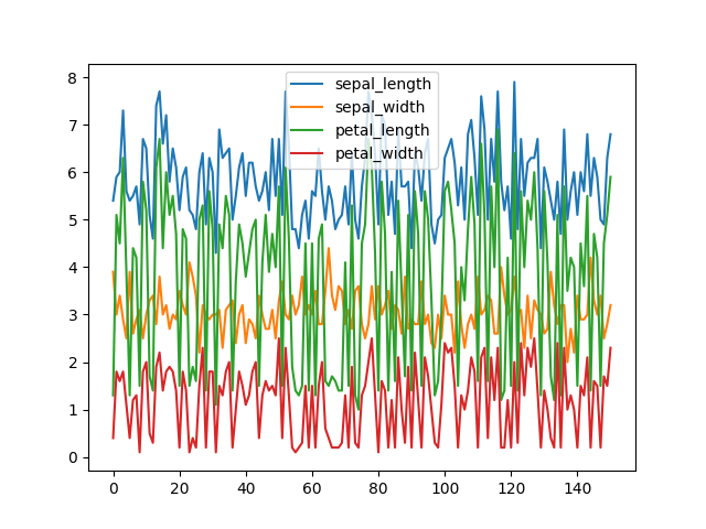
Figure 6.19. Line Plot
>>> plot = df.plot(kind='line', subplots=True)
>>> plt.show()
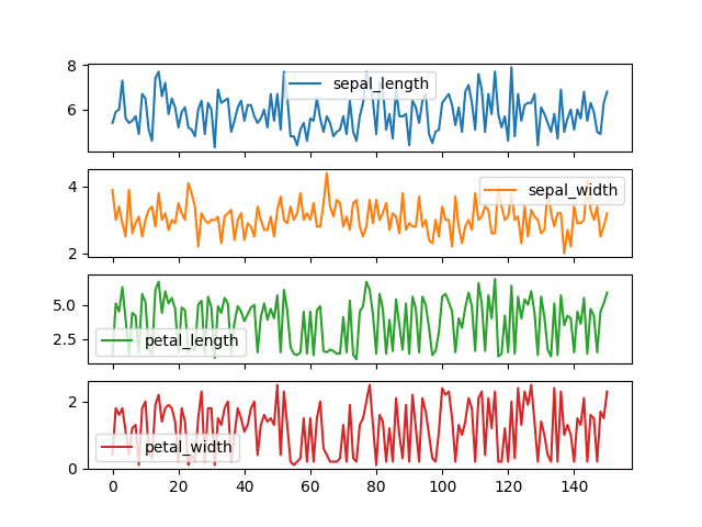
Figure 6.20. Line Plot with Subplots
>>> plot = df.plot(kind='line',
...                subplots=True,
...                layout=(2,2),
...                sharex=True,
...                sharey=True)
>>> plt.show()
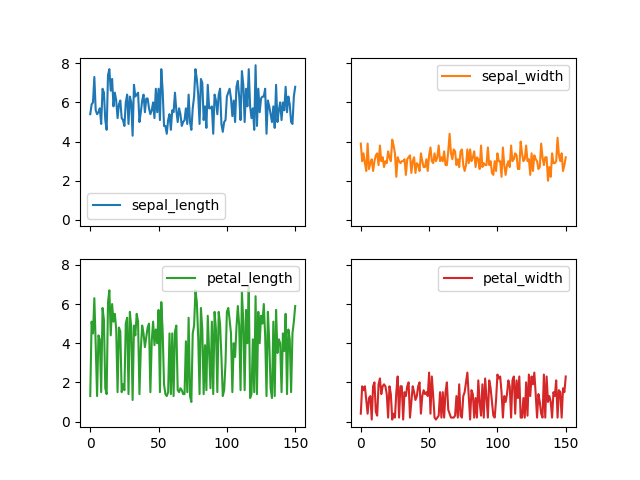
Figure 6.21. Line Plot with Subplots and Layout
6.24.5. Vertical Bar Plot
>>> plot = df.plot(kind='bar', subplots=True, layout=(2,2))
>>> plt.show()
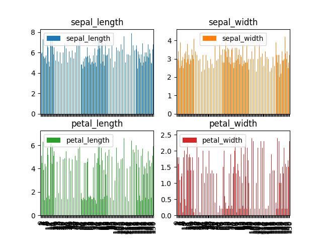
Figure 6.22. Vertical Bar Plot
6.24.6. Horizontal Bar Plot
>>> plot = df.plot(kind='barh',
...                title='Iris',
...                ylabel='centimeters',
...                xlabel='iris',
...                subplots=True,
...                layout=(2,2),
...                sharex=True,
...                sharey=True,
...                legend='upper right',
...                grid=True,
...                figsize=(10,10))
>>> plt.show()
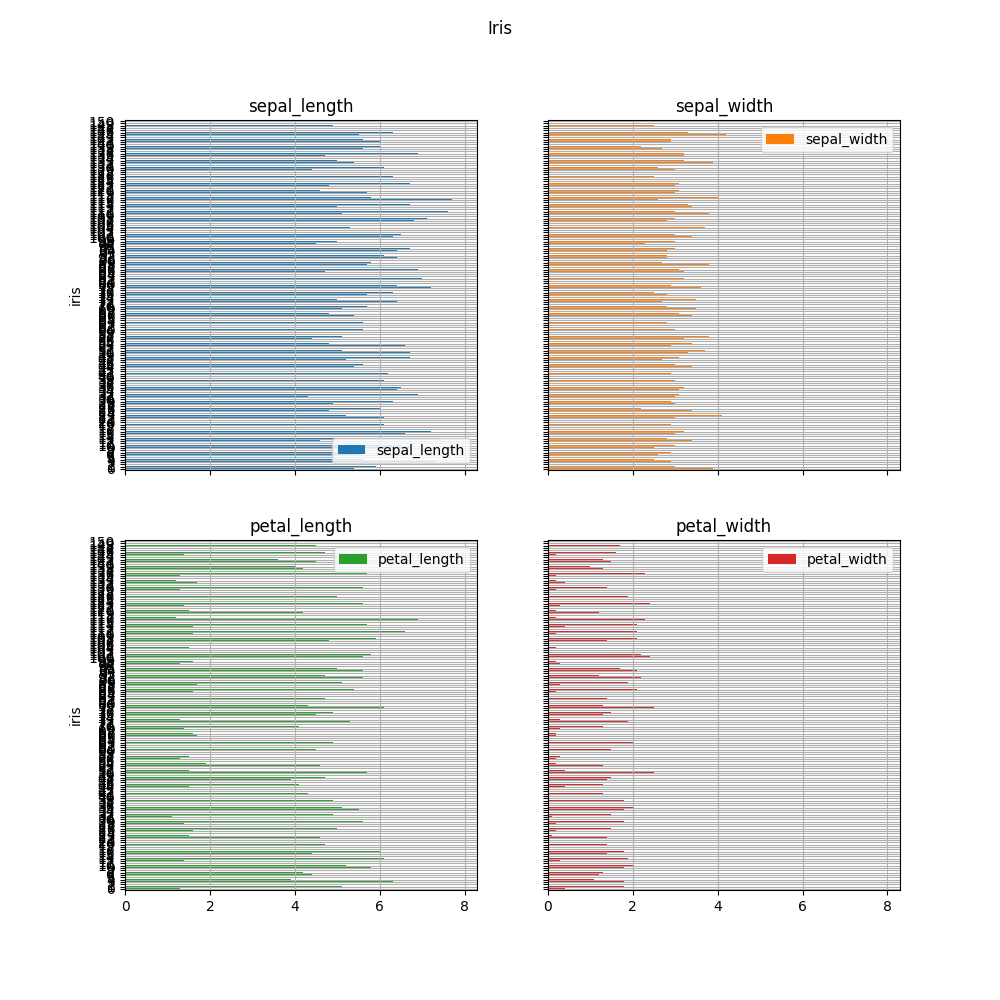
Figure 6.23. Horizontal Bar Plot
6.24.7. Histogram
>>> plot = df.plot(kind='hist',
...                rwidth=0.8,
...                xlabel='centimeters',
...                title='Iris Dimensions Frequency')
>>> plt.show()
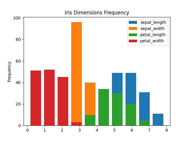
Figure 6.24. Histogram
>>> plot = df.plot(kind='hist',
...                rwidth=0.8,
...                xlabel='centimeters',
...                title='Iris Dimensions Frequency',
...                subplots=True,
...                layout=(2,2),
...                sharex=True,
...                sharey=True)
>>> plt.show()
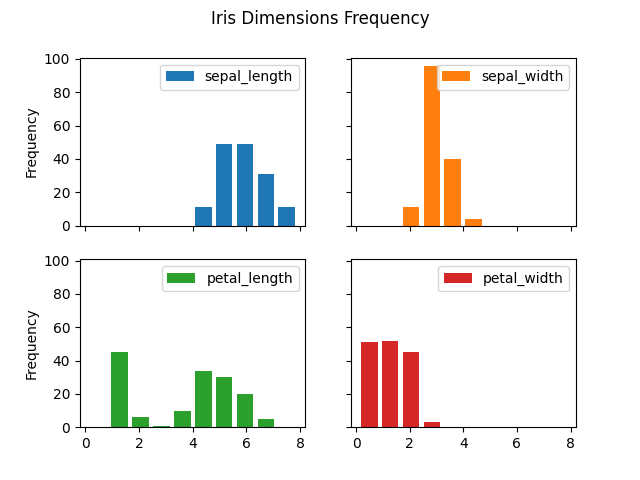
Figure 6.25. Histogram
>>> plot = df.hist()
>>> plt.show()
Figure 6.26. Visualization using hist
>>> plot = df['sepal_length'].hist(bins=3,
...                                rwidth=0.8,
...                                legend=None,
...                                grid=False)
>>>
>>> _ = plot.xaxis.set_ticks(ticks=[4.9, 6.1, 7.3],
...                          labels=['small', 'medium', 'large'])
>>> plt.show()
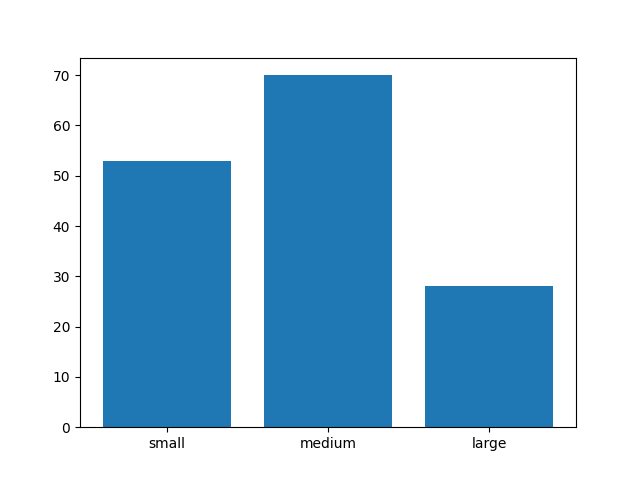
Figure 6.27. Visualization using hist
6.24.8. Boxplot
>>> plot = df.plot(kind='box')
>>> plt.show()
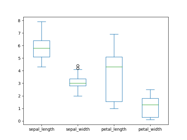
Figure 6.28. Boxplot
>>> plot = df.plot(kind='box',
...                subplots=True,
...                layout=(2,2),
...                sharex=False,
...                sharey=False)
>>>
>>> plt.show()
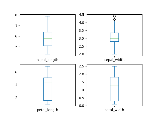
Figure 6.29. Boxplot with layout
6.24.9. Kernel Density Estimation Plot
Also known as
kind='kde'- Kernel Density Estimation
>>> plot = df.plot(kind='density')
>>> plt.show()
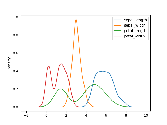
Figure 6.30. Kernel Density Estimation Plot
>>> #
... plot = df.plot(
...     kind='density',
...     subplots=True,
...     layout=(2,2),
...     sharex=False,
... )
>>>
>>> plt.subplots_adjust(hspace=0.5, wspace=0.5)  # margins between charts
>>> plt.show()
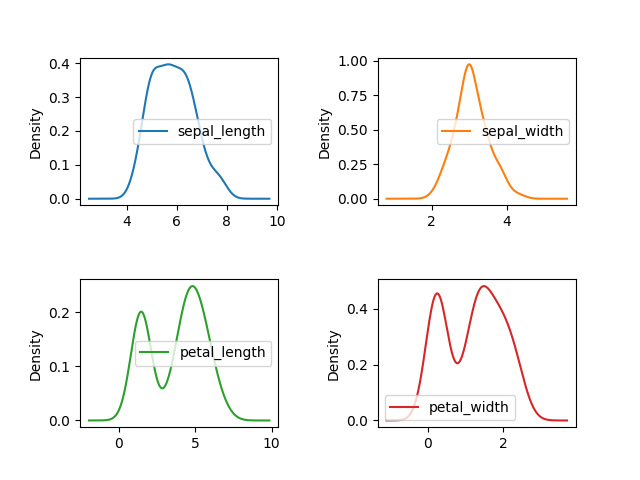
Figure 6.31. Density plot with margins
6.24.10. Area Plot
>>> plot = df.plot(kind='area')
>>> plt.show()
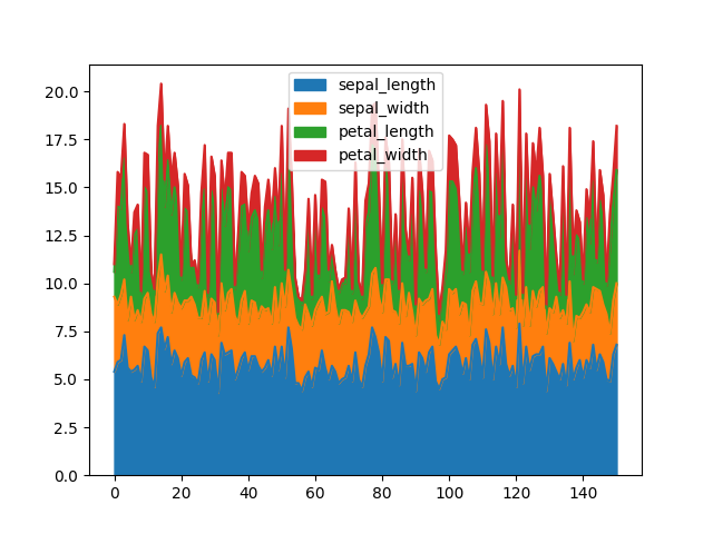
Figure 6.32. Area Plot
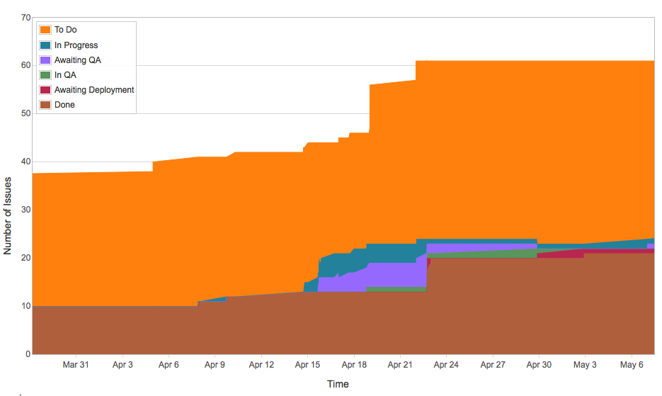
Figure 6.33. Cumulative Flow Diagram in Atlassian Jira
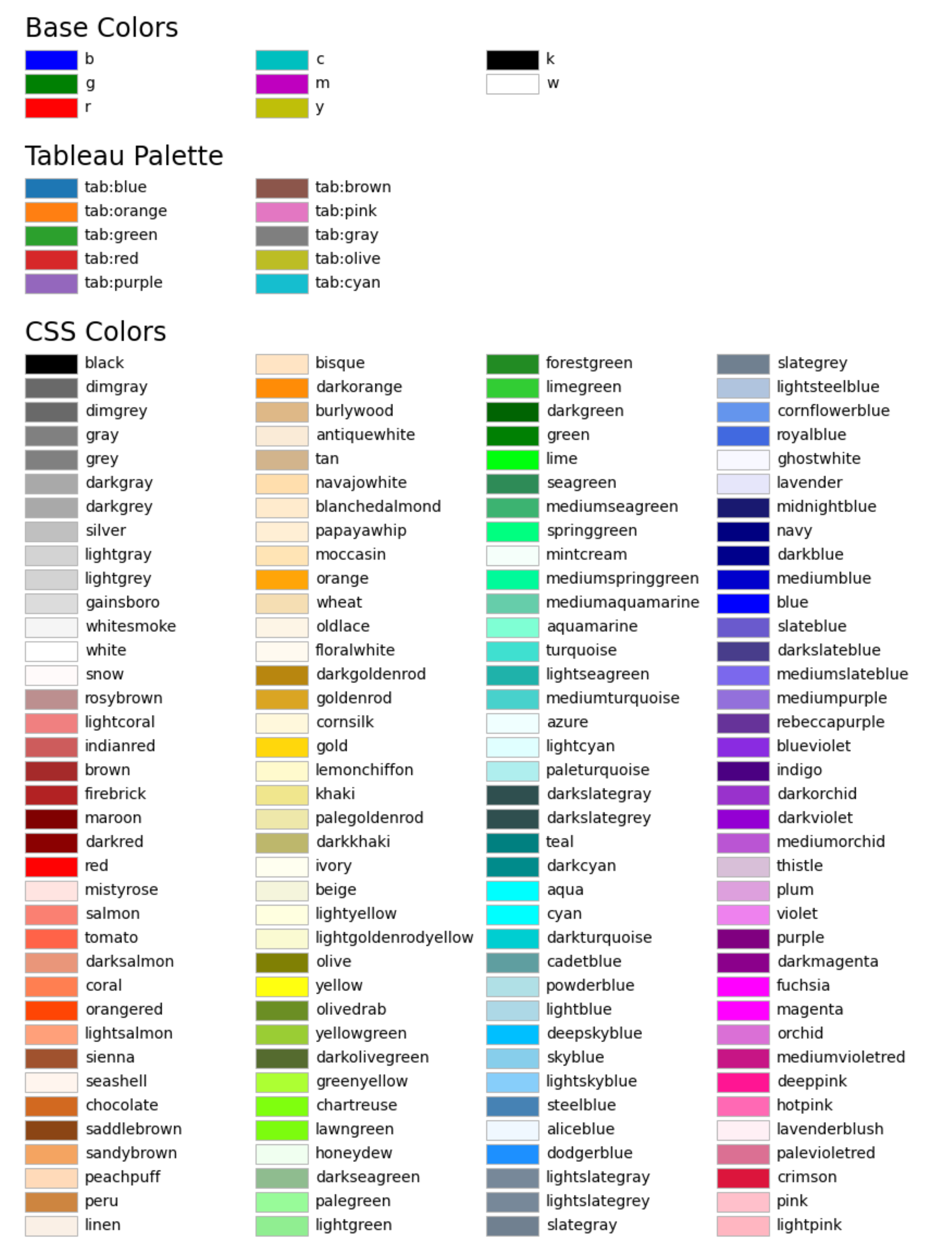
6.24.11. Pie Plot
List of Matplotlib color names [1]
>>> data = pd.cut(df['sepal_length'],
...               bins=[3, 5, 7, np.inf],
...               labels=['small', 'medium', 'large'],
...               include_lowest=True).value_counts()
>>>
>>> plot = data.plot(kind='pie',
...                  autopct='%1.0f%%',
...                  colors=['plum', 'violet', 'magenta'],
...                  explode=[0.1, 0, 0],
...                  shadow=True,
...                  startangle=-215,
...                  xlabel=None,
...                  ylabel=None,
...                  title='sepal_length\nsmall: 0.0 to 3.0\nmedium: 3.0 to 5.0\nlarge: 7.0 to inf',
...                  figsize=(10,10))
>>>
>>> plt.show()
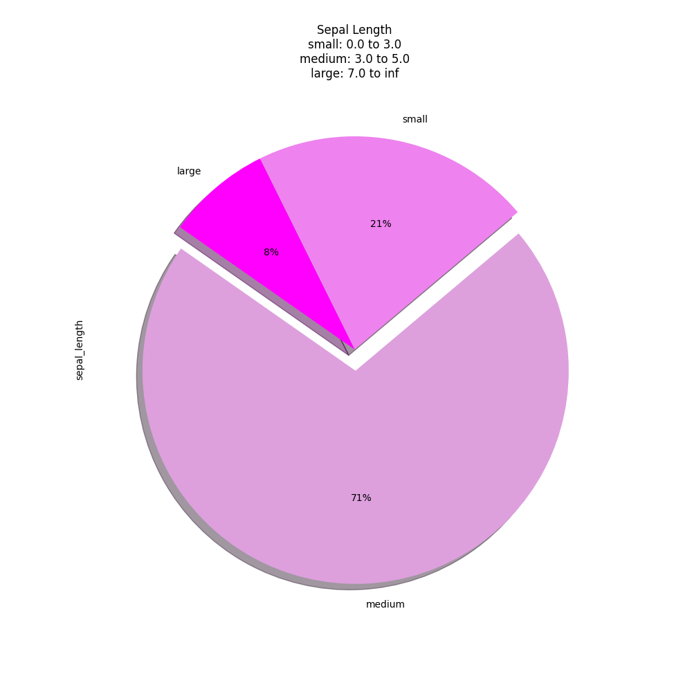
Figure 6.35. Pie Plot
6.24.12. Scatter Plot
>>> plot = df.plot(kind='scatter', x='sepal_length', y='sepal_width')
>>> plt.show()
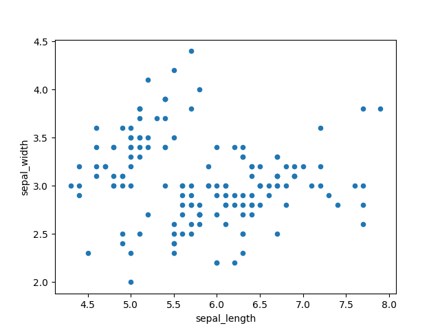
Figure 6.36. Scatter plot: sepal_length vs. sepal_width
>>> plot = df.plot(kind='scatter', x='petal_length', y='petal_width')
>>> plt.show()
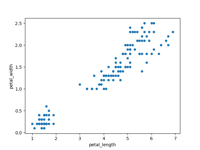
Figure 6.37. Scatter plot: petal_length vs. petal_width
>>> data = df.replace({'setosa': 0,
...                    'virginica': 1,
...                    'versicolor': 2})
>>>
>>> plot = data.plot(kind='scatter',
...                  x='sepal_length',
...                  y='sepal_width',
...                  colormap='viridis',
...                  c='species')
>>> plt.show()
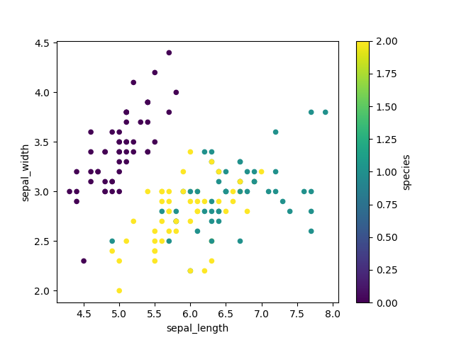
Figure 6.38. Scatter plot using viridis colormap
6.24.13. Hexbin Plot
>>> plot = df.plot(kind='hexbin', x='petal_length', y='petal_width')
>>> plt.show()
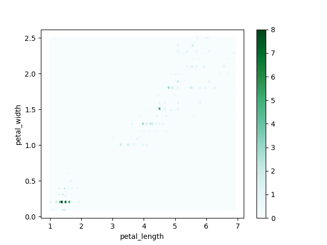
Figure 6.39. Hexbin Plot
6.24.14. Scatter matrix
The in
pandasversion0.22plotting module has been moved frompandas.tools.plottingtopandas.plottingAs of version
0.19, thepandas.plottinglibrary did not exist
>>> from pandas.plotting import scatter_matrix
>>>
>>> plot = scatter_matrix(df)
>>> plt.show()
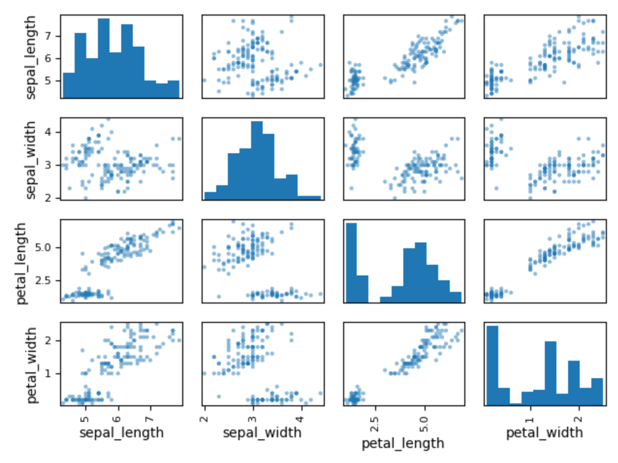
Figure 6.40. Scatter Matrix
>>> data = df[['sepal_length', 'sepal_width', 'petal_length', 'petal_width']]
>>> colors = df['species'].replace({'setosa': 0, 'virginica': 1, 'versicolor': 2})  # colors must be numerical
>>>
>>> plot = scatter_matrix(data, c=colors)
>>> plt.show()
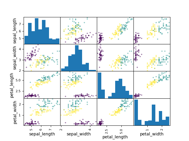
Figure 6.41. Scatter Matrix with colors
6.24.15. Actinograms
6.24.16. Further Reading
6.24.17. References
6.24.18. Assignments
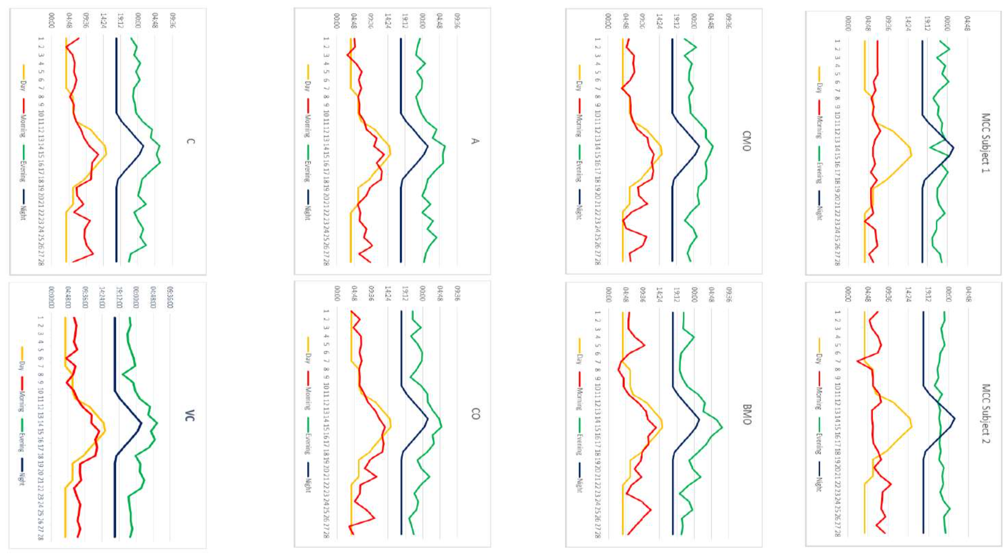
# FIXME: za trudne zadanie, przenieść je do case study
# FIXME: Write solution

# %% About
# - Name: DataFrame Plot
# - Difficulty: medium
# - Lines: 15
# - Minutes: 21

# %% License
# - Copyright 2025, Matt Harasymczuk <matt@python3.info>
# - This code can be used only for learning by humans
# - This code cannot be used for teaching others
# - This code cannot be used for teaching LLMs and AI algorithms
# - This code cannot be used in commercial or proprietary products
# - This code cannot be distributed in any form
# - This code cannot be changed in any form outside of training course
# - This code cannot have its license changed
# - If you use this code in your product, you must open-source it under GPLv2
# - Exception can be granted only by the author

# %% English
# 1. Read data from `DATA` as `df: pd.DataFrame`
# 2. Select `Luminance` stylesheet
# 3. Parse column with dates
# 4. Select desired date and location, then resample by hour
# 5. Display chart (line) with activity hours in "Sleeping Quarters upper" location
# 6. Active is when `Luminance` is not zero
# 7. Easy: for day 2019-09-28
# 8. Advanced: for each day, as subplots
# 9. Run doctests - all must succeed

# %% Polish
# 1. Wczytaj dane z `DATA` jako `df: pd.DataFrame`
# 2. Wybierz arkusz `Luminance`
# 3. Sparsuj kolumny z datami
# 4. Wybierz pożądaną datę i lokację, następnie próbkuj co godzinę
# 5. Aktywność jest gdy `Luminance` jest różna od zera
# 6. Wyświetl wykres (line) z godzinami aktywności w dla lokacji "Sleeping Quarters upper"
# 7. Łatwe: dla dnia 2019-09-28
# 8. Zaawansowane: dla wszystkich dni, jako subplot
# 9. Uruchom doctesty - wszystkie muszą się powieść

# %% Expected
# >>> result
#     datetime
#     2019-09-28 00:00:00+00:00    1
#     2019-09-28 01:00:00+00:00    1
#     2019-09-28 02:00:00+00:00    1
#     2019-09-28 03:00:00+00:00    1
#     2019-09-28 04:00:00+00:00    0
#     2019-09-28 05:00:00+00:00    0
#     2019-09-28 06:00:00+00:00    0
#     2019-09-28 07:00:00+00:00    0
#     2019-09-28 08:00:00+00:00    0
#     2019-09-28 09:00:00+00:00    0
#     2019-09-28 10:00:00+00:00    0
#     2019-09-28 11:00:00+00:00    0
#     2019-09-28 12:00:00+00:00    1
#     2019-09-28 13:00:00+00:00    1
#     2019-09-28 14:00:00+00:00    1
#     2019-09-28 15:00:00+00:00    1
#     2019-09-28 16:00:00+00:00    1
#     2019-09-28 17:00:00+00:00    1
#     2019-09-28 18:00:00+00:00    1
#     2019-09-28 19:00:00+00:00    1
#     2019-09-28 20:00:00+00:00    1
#     2019-09-28 21:00:00+00:00    1
#     2019-09-28 22:00:00+00:00    1
#     2019-09-28 23:00:00+00:00    1
#     Freq: h, Name: value, dtype: int64

# %% Hints
# - `pd.Series.apply(np.sign)` :ref:`Numpy signum`
# - `pd.Series.resample('H').sum()`

# %% Doctests
"""
>>> import sys; sys.tracebacklimit = 0

>>> assert sys.version_info >= (3, 9), \
'Python has an is invalid version; expected: `3.9` or newer.'

>>> assert 'result' in globals(), \
'Variable `result` is not defined; assign result of your program to it.'

>>> assert result is not Ellipsis, \
'Variable `result` has an invalid value; assign result of your program to it.'

>>> assert type(result) is pd.Series, \
'Variable `result` has an invalid type; expected: `pd.Series`.'

>>> pd.set_option('display.max_columns', 50)
>>> pd.set_option('display.max_rows', 200)
>>> pd.set_option('display.width', 500)
>>> pd.set_option('display.memory_usage', 'deep')
>>> pd.set_option('display.precision', 4)

>>> result  # doctest: +NORMALIZE_WHITESPACE
datetime
2019-09-28 00:00:00+00:00    1
2019-09-28 01:00:00+00:00    1
2019-09-28 02:00:00+00:00    1
2019-09-28 03:00:00+00:00    1
2019-09-28 04:00:00+00:00    0
2019-09-28 05:00:00+00:00    0
2019-09-28 06:00:00+00:00    0
2019-09-28 07:00:00+00:00    0
2019-09-28 08:00:00+00:00    0
2019-09-28 09:00:00+00:00    0
2019-09-28 10:00:00+00:00    0
2019-09-28 11:00:00+00:00    0
2019-09-28 12:00:00+00:00    1
2019-09-28 13:00:00+00:00    1
2019-09-28 14:00:00+00:00    1
2019-09-28 15:00:00+00:00    1
2019-09-28 16:00:00+00:00    1
2019-09-28 17:00:00+00:00    1
2019-09-28 18:00:00+00:00    1
2019-09-28 19:00:00+00:00    1
2019-09-28 20:00:00+00:00    1
2019-09-28 21:00:00+00:00    1
2019-09-28 22:00:00+00:00    1
2019-09-28 23:00:00+00:00    1
Freq: h, Name: value, dtype: int64
"""

# %% Run
# - PyCharm: right-click in the editor and `Run Doctest in ...`
# - PyCharm: keyboard shortcut `Control + Shift + F10`
# - Terminal: `python -m doctest -f -v myfile.py`

# %% Imports
import numpy as np
import pandas as pd

# %% Types
result: pd.Series

# %% Data
DATA = 'https://python3.info/_static/aatc-mission-exp12.xlsx'
WHERE = 'Sleeping Quarters upper'
WHEN = '2019-09-28'

# %% Result
result = ...