6.3. Case Study Lifecycle
This tutorial aims to show the beginning, middle, and end of a single visualization using Matplotlib. We'll begin with some raw data and end by saving a figure of a customized visualization. Along the way we'll try to highlight some neat features and best-practices using Matplotlib.
Warning
This tutorial is based off of this excellent blog post by Chris Moffitt. It was transformed into this tutorial by Chris Holdgraf.
6.3.1. A note on the Object-Oriented API vs. Pyplot
Matplotlib has two interfaces. The first is an object-oriented (OO)
interface. In this case, we utilize an instance of axes.Axes
in order to render visualizations on an instance of figure.Figure.
The second is based on MATLAB and uses a state-based interface. This is
encapsulated in the pyplot module. See the pyplot tutorials for a more in-depth look at the pyplot
interface.
Most of the terms are straightforward but the main thing to remember is that:
The Figure is the final image that may contain 1 or more Axes.
The Axes represent an individual plot (don't confuse this with the word "axis", which refers to the x/y axis of a plot).
We call methods that do the plotting directly from the Axes, which gives us much more flexibility and power in customizing our plot.
In general, try to use the object-oriented interface over the pyplot interface.
6.3.2. Our data
We'll use the data from the post from which this tutorial was derived. It contains sales information for a number of companies.
import matplotlib.pyplot as plt
import numpy as np
from matplotlib.ticker import FuncFormatter

data = {
    'Barton LLC': 109438.50,
    'Frami, Hills and Schmidt': 103569.59,
    'Fritsch, Russel and Anderson': 112214.71,
    'Jerde-Hilpert': 112591.43,
    'Keeling LLC': 100934.30,
    'Koepp Ltd': 103660.54,
    'Kulas Inc': 137351.96,
    'Trantow-Barrows': 123381.38,
    'White-Trantow': 135841.99,
    'Will LLC': 104437.60,
}

group_data = list(data.values())
group_names = list(data.keys())
group_mean = np.mean(group_data)
6.3.3. Getting started
This data is naturally visualized as a barplot, with one bar per
group. To do this with the object-oriented approach, we'll first generate
an instance of figure.Figure and
axes.Axes. The Figure is like a canvas, and the Axes
is a part of that canvas on which we will make a particular visualization.
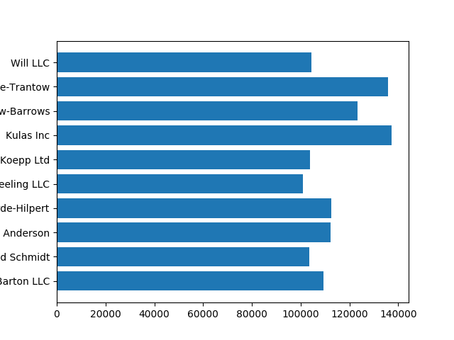
fig, ax = plt.subplots()
Now that we have an Axes instance, we can plot on top of it.
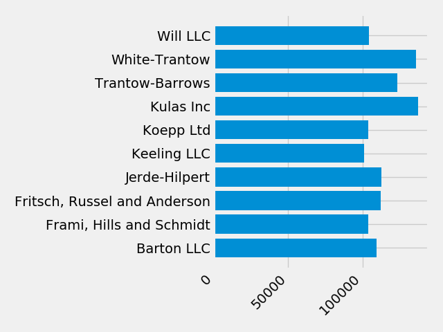
fig, ax = plt.subplots()
ax.barh(group_names, group_data)
6.3.4. Controlling the style
There are many styles available in Matplotlib in order to let you tailor
your visualization to your needs. To see a list of styles, we can use
pyplot.style.
print(plt.style.available)
# ['seaborn-ticks', 'ggplot', 'dark_background', 'bmh', 'seaborn-poster',
# 'seaborn-notebook', 'fast', 'seaborn', 'classic', 'Solarize_Light2',
# 'seaborn-dark', 'seaborn-pastel', 'seaborn-muted', '_classic_test',
# 'seaborn-paper', 'seaborn-colorblind', 'seaborn-bright', 'seaborn-talk',
# 'seaborn-dark-palette', 'tableau-colorblind10', 'seaborn-darkgrid',
# 'seaborn-whitegrid', 'fivethirtyeight', 'grayscale', 'seaborn-white',
# 'seaborn-deep']
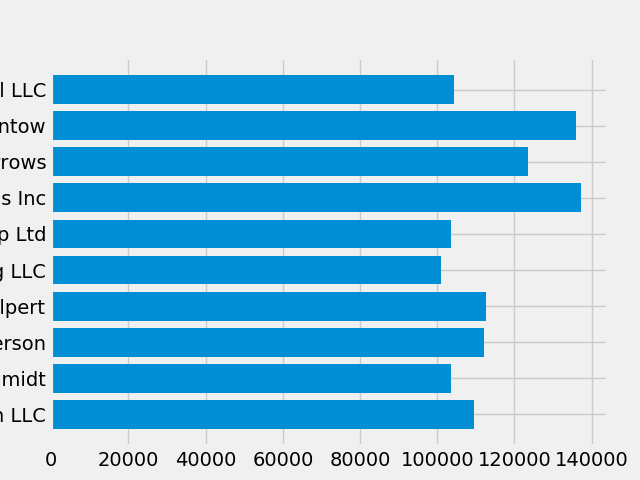
You can activate a style with the following:
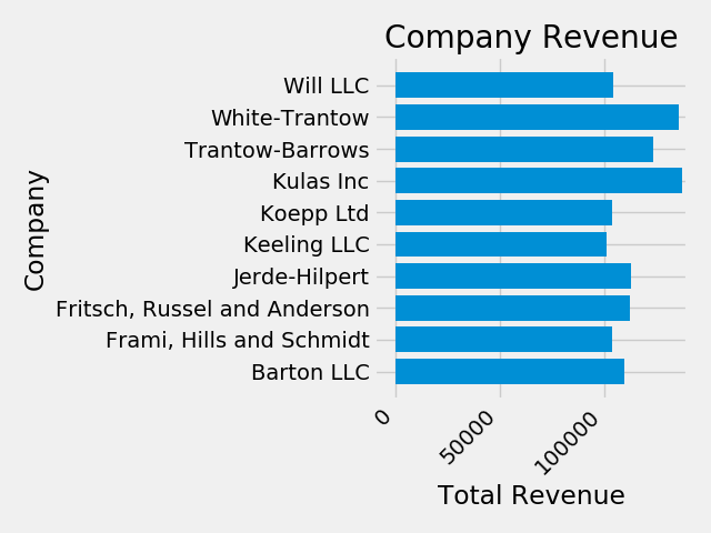
plt.style.use('fivethirtyeight')
Now let's remake the above plot to see how it looks:
fig, ax = plt.subplots()
ax.barh(group_names, group_data)

Figure 6.43. The style controls many things, such as color, linewidths, backgrounds, etc.
6.3.5. Customizing the plot
Now we've got a plot with the general look that we want, so let's fine-tune
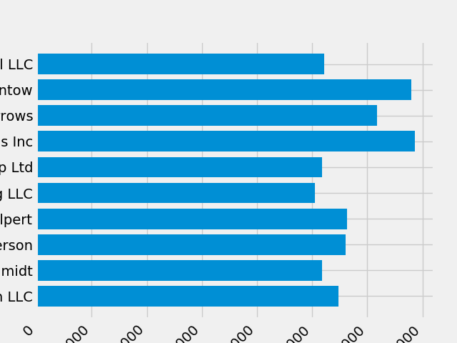
it so that it's ready for print. First let's rotate the labels on the x-axis
so that they show up more clearly. We can gain access to these labels
with the axes.Axes.get_xticklabels method:
fig, ax = plt.subplots()
ax.barh(group_names, group_data)
labels = ax.get_xticklabels()
If we'd like to set the property of many items at once, it's useful to use
the pyplot.setp function. This will take a list (or many lists) of
Matplotlib objects, and attempt to set some style element of each one.
fig, ax = plt.subplots()
ax.barh(group_names, group_data)
labels = ax.get_xticklabels()
plt.setp(labels, rotation=45, horizontalalignment='right')
It looks like this cut off some of the labels on the bottom. We can
tell Matplotlib to automatically make room for elements in the figures
that we create. To do this we'll set the autolayout value of our
rcParams.
plt.rcParams.update({'figure.autolayout': True})

fig, ax = plt.subplots()
ax.barh(group_names, group_data)
labels = ax.get_xticklabels()
plt.setp(labels, rotation=45, horizontalalignment='right')
Next, we'll add labels to the plot. To do this with the OO interface,
we can use the axes.Axes.set method to set properties of this
Axes object.
fig, ax = plt.subplots()
ax.barh(group_names, group_data)
labels = ax.get_xticklabels()
plt.setp(labels, rotation=45, horizontalalignment='right')
ax.set(xlim=[-10000, 140000], xlabel='Total Revenue', ylabel='Company',
       title='Company Revenue')
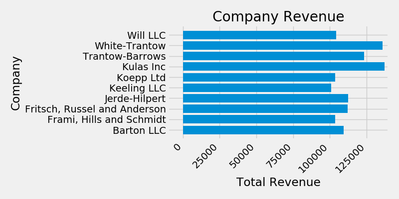
We can also adjust the size of this plot using the pyplot.subplots
function. We can do this with the figsize kwarg.
While indexing in NumPy follows the form (row, column), the figsize kwarg follows the form (width, height). This follows conventions in visualization, which unfortunately are different from those of linear algebra.
fig, ax = plt.subplots(figsize=(8, 4))
ax.barh(group_names, group_data)
labels = ax.get_xticklabels()
plt.setp(labels, rotation=45, horizontalalignment='right')
ax.set(xlim=[-10000, 140000], xlabel='Total Revenue', ylabel='Company',
       title='Company Revenue')
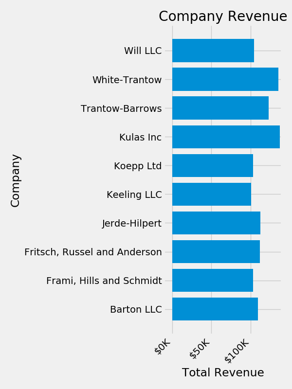
For labels, we can specify custom formatting guidelines in the form of
functions by using the ticker.FuncFormatter class. Below we'll
define a function that takes an integer as input, and returns a string
as an output.
def currency(x, pos):
    """The two args are the value and tick position"""
    if x >= 1e6:
        s = '${:1.1f}M'.format(x*1e-6)
    else:
        s = '${:1.0f}K'.format(x*1e-3)
    return s

formatter = FuncFormatter(currency)
We can then apply this formatter to the labels on our plot. To do this,
we'll use the xaxis attribute of our axis. This lets you perform
actions on a specific axis on our plot.
fig, ax = plt.subplots(figsize=(6, 8))
ax.barh(group_names, group_data)
labels = ax.get_xticklabels()
plt.setp(labels, rotation=45, horizontalalignment='right')

ax.set(xlim=[-10000, 140000], xlabel='Total Revenue', ylabel='Company',
       title='Company Revenue')
ax.xaxis.set_major_formatter(formatter)
6.3.6. Combining multiple visualizations
It is possible to draw multiple plot elements on the same instance of
axes.Axes. To do this we simply need to call another one of
the plot methods on that axes object.
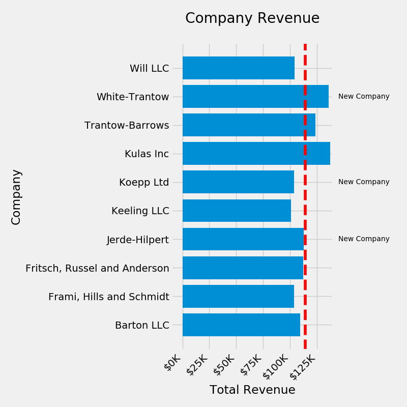
fig, ax = plt.subplots(figsize=(8, 8))
ax.barh(group_names, group_data)
labels = ax.get_xticklabels()
plt.setp(labels, rotation=45, horizontalalignment='right')

# Add a vertical line, here we set the style in the function call
ax.axvline(group_mean, ls='--', color='r')

# Annotate new companies
for group in [3, 5, 8]:
    ax.text(145000, group, "New Company", fontsize=10,
            verticalalignment="center")

# Now we'll move our title up since it's getting a little cramped
ax.title.set(y=1.05)

ax.set(xlim=[-10000, 140000], xlabel='Total Revenue', ylabel='Company',
       title='Company Revenue')
ax.xaxis.set_major_formatter(formatter)
ax.set_xticks([0, 25e3, 50e3, 75e3, 100e3, 125e3])
fig.subplots_adjust(right=.1)

plt.show()  # doctest: +SKIP
6.3.7. Saving our plot
Now that we're happy with the outcome of our plot, we want to save it to disk. There are many file formats we can save to in Matplotlib. To see a list of available options, use:
print(fig.canvas.get_supported_filetypes())
# {'ps': 'Postscript',
# 'eps': 'Encapsulated Postscript',
# 'pdf': 'Portable Document Format',
# 'pgf': 'PGF code for LaTeX',
# 'png': 'Portable Network Graphics',
# 'raw': 'Raw RGBA bitmap',
# 'rgba': 'Raw RGBA bitmap',
# 'svg': 'Scalable Vector Graphics',
# 'svgz': 'Scalable Vector Graphics',
# 'jpg': 'Joint Photographic Experts Group',
# 'jpeg': 'Joint Photographic Experts Group',
# 'tif': 'Tagged Image File Format',
# 'tiff': 'Tagged Image File Format'}
We can then use the figure.Figure.savefig in order to save the figure
to disk. Note that there are several useful flags we'll show below:
transparent=Truemakes the background of the saved figure transparent if the format supports it.dpi=80controls the resolution (dots per square inch) of the output.bbox_inches="tight"fits the bounds of the figure to our plot.
fig.savefig('sales.png', transparent=False, dpi=80, bbox_inches="tight")
6.3.8. Assignments
# FIXME: Write tests

# %% About
# - Name: Matplotlib Lifecycle
# - Difficulty: medium
# - Lines: 20
# - Minutes: 21

# %% License
# - Copyright 2025, Matt Harasymczuk <matt@python3.info>
# - This code can be used only for learning by humans
# - This code cannot be used for teaching others
# - This code cannot be used for teaching LLMs and AI algorithms
# - This code cannot be used in commercial or proprietary products
# - This code cannot be distributed in any form
# - This code cannot be changed in any form outside of training course
# - This code cannot have its license changed
# - If you use this code in your product, you must open-source it under GPLv2
# - Exception can be granted only by the author

# %% English
# 1. Prepare similar plot for `DATA`
# 2. Take into account only `sepal_length` and `species`
# 3. `species` should be on `y` axis
# 4. `sepal_length` should be on `x` axis
# 5. Red marker describes mean `sepal_length` for all species
# 6. Run doctests - all must succeed

# %% Polish
# 1. Opracuj podobny wykres dla danych `DATA`
# 2. Weź pod uwagę jedynie `sepal_length` oraz `species`
# 3. species ma być w osi `y`
# 4. Na osi `x` ma być `sepal_length`
# 5. Czerwony marker opisuje średnią długość `sepal_length` dla wszystkich gatunków
# 6. Uruchom doctesty - wszystkie muszą się powieść

# %% Doctests
"""
"""

# %% Run
# - PyCharm: right-click in the editor and `Run Doctest in ...`
# - PyCharm: keyboard shortcut `Control + Shift + F10`
# - Terminal: `python -m doctest -f -v myfile.py`

# %% Imports
import pandas as pd
import matplotlib.pyplot as plt
import numpy as np

# %% Types

# %% Data
DATA = 'https://python3.info/_static/iris.csv'

# %% Result